一、计划布局
- 把网页划分为数个大的结构性区域,如页眉、内容区和页脚等,作为模版
- 设计不同的内容区域,如导航栏、侧边栏等
- 设计布局和定位,如单列或多列等
- 使用绘图纸、铅笔或APP,详细设计结构和尺寸,画出网格和参考线
- 提前选择将要使用的元素、为各个区域和元素命名
id和class,并设计颜色、尺寸等
- 打印设计稿,圈出结构,添加批注,以供参考
二、单列布局
1、水平居中
- 水平居中的页面布局中最为常见的一种布局形式,多出现于标题,以及内容区域的组织形式。
- 注意:各个实例中实现的是child元素的对齐操作,child元素的父容器是parent元素
使用inline-block和text-align实现
.parent {
    text-align: center;
}

.child {
    display: inline-block;
}
优点:兼容性好 缺点:需要同时设置子元素和父元素
使用margin:0 auto;实现
.child {
    width: 200px;
    margin: 0 auto;
}
优点:兼容性好 缺点:需要指定宽度
使用display: table;实现
.child {
    display: table;
    margin: 0 auto;
}
优点:只需要对自身进行设置 缺点:IE6、7需要调整结构
使用绝对定位实现
.parent {
    position: relative;
}
/*或者设置margin-left的负值为盒子宽度的一半,但必须知道盒子的宽度,且兼容性好*/

.child {
    position: absolute;
    left: 50%;
    transform: translate(-50%);
}
缺点:兼容性差,IE9及以上可用
使用display: flex;布局实现
/*第一种方法*/
.parent {
    display: flex;
    justify-content: center;
}

 /*第二种方法*/
.parent {
    display: flex;
}

.child {
    margin: 0 auto;
}
缺点:兼容性差,如果使用大面积的该布局可能会影响效率
2、垂直居中
vertical-align
只有一个元素属于inline或是inline-block,vertical-align属性才会起作用。在使用vertical-align时,由于对齐的基线是用行高的基线作为标记,故需要设置line-height或设置display: table-cell;
/*第一种方法*/
.parent {
    display: table-cell;
    vertical-align: middle;
    height: 20px;
}

 /*第二种方法*/
.parent {
    display: inline-block;
    vertical-align: middle;
    line-height: 20px;
}
使用绝对定位实现
.parent {
    position: relative;
}

 .child{
    position: absolute;
    top: 50%;
    transform: translate(0, -50%);
}
使用flex实现
.parent {
    display: flex;
    align-items: center;
}
3、水平垂直居中
使用vertical-align,text-align,inline-block实现
.parent {
    display: table-cell;
    vertical-align: middle;
    text-align: center;
}

 .child {
    display: inline-block;
}
使用绝对定位实现
.parent {
    position: absolute;
}

 .child {
    position: absolute;
    top: 50%;
    left: 50%;
    transform: translate(-50%, -50%);
}
使用flex实现
.parent {
    display: flex;
    justify-content: center;
    align-items: center;
}
三、多列布局
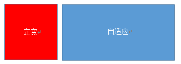
1、左列定宽,右列自适应
该布局方式非常常见,适用于定宽的一侧常为导航,自适应的一侧为内容的布局
使用float和margin实现
.left {
    float: left;
    width: 100px;
}

 .right {
    margin-left: 100px;
}
注:IE6会有3px的bug
使用float和margin(fix)实现
<div class="parent">
    <div class="left"></div>
    <div class="right-fix">
        <div class="right"></div>
    </div>
</div>
.left {
    width: 100px;
    float: left;
}

 .right-fix {
    width: 100%;
    margin-left: -100px;
    float: right;
}

 .right {
    margin-left: 100px;
}
使用float和overflow实现
.left {
      width: 100px;
      float: left;
}

.right {
    overflow: hidden;
}
如果我们需要将两列设置为等高,可以用下述方法将“背景”设置为等高,其使并不是内容的等高
.left {
    width: 100px;
    float: left;
}

 .right {
    overflow: hidden;
}

 .parent {
    overflow: hidden;
}

 .left, .right {
    padding-bottom: 9999px;
    margin-bottom: -9999px;
}
使用table实现
.parent {
    display: table;
    table-layout: fixed;
    width: 100%;
}

 .left {
    width: 100px;
}

 .right, .left {
    display: table-cell;
}
使用flex实现
.parent {
    display: flex;
}

 .left {
    width: 100px;
}

 .right {
    flex: 1;
}
使用右侧容器的flex: 1;,均分了剩余的宽度,也实现了同样的效果。而align-items默认值为stretch,故二者高度相等
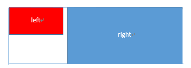
2、右列定宽,左列自适应
使用float和margin实现
.parent {
    background: red;
    height: 100px;
    margin: 0 auto;
}

.left {
    background: green;
    margin-right: -100px;
    width: 100%;
    float: left;
}

.right {
    float: right;
    width: 100px;
    background: blue;
}
使用table实现
.parent {
    display: table;
    table-layout: fixed;
    width: 100%;
}

.left {
    display: table-cell;
}

.right {
    width: 100px;
    display: table-cell;
}
- 使用
flex实现
.parent {
    display: flex;
}

.left {
    flex: 1;
}

.right {
    width: 100px;
}
3、两列定宽,一列自适应
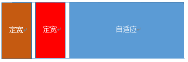
html结构是父容器为parent,自容器为left,center,right。其中left,center定宽,right自适应
使用float和margin实现
.left, .center {
    float: left;
    width: 200px;
}

.right {
    margin-left: 400px;
}
使用float和overflow实现
.left, .center {
    float: left: width: 200px;
}

.right {
    overflow: hidden;
}
使用table实现
.parent {
    display: table;
    table-layout: fixed;
    width: 100%;
}

.left, .center, .right {
    display: table-cell;
}

.left, .center {
    width: 200px;
}
- 使用
flex实现
.parent {
    display: flex;
}

.left, .center {
    width: 100px;
}

.right {
    flex: 1;
}
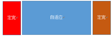
4、两侧定宽,中栏自适应
使用float和margin实现
.left {
    width: 100px;
    float: left;
}

.center {
    float: left;
    width: 100%;
    margin-right: -200px;
}

.right {
    width: 100px;
    float: right;
}
使用table实现
.parent {
    width: 100%;
    display: table;
    table-layout: fixed;
}

.left, .center, .right {
    display: table-cell;
}

.left {
    width: 100px;
}

.right {
    width: 100px;
}
使用flex实现
.parent {
    display: flex;
}

.left {
    width: 100px;
}

.center {
    flex: 1;
}

.right {
    width: 100px;
}
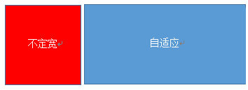
5、一列不定宽,一列自适应
使用float和overflow实现
.left {
    float: left;
}

.right {
    overflow: hidden;
}
- 使用
table实现
.parent {
    display: table;
    table-layout: fixed;
    width: 100%;
}

.left {
    width: 0.1%;
}

.left, .right {
    display: table-cell;
}
- 使用
flex实现
.parent {
    display: flex;
}

.right {
    flex: 1;
}
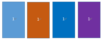
6、多列等分布局
多列等分布局常出现在内容中,多数为功能的,同阶级内容的并排显示等
<div class="parent">
      <div class="column">1</div>
      <div class="column">1</div>
      <div class="column">1</div>
      <div class="column">1</div>
</div>
使用float实现
.parent {
    margin-left: -20px;/*假设列之间的间距为20px*/
}

.column {
    float: left;
    width: 25%;
    padding-left: 20px;
    box-sizing: border-box;
}
- 使用
table实现
.parent-fix {
    margin-left: -20px;
}

.parent {
    display: table;
    table-layout: fixed;
    width: 100%;
}

.column {
    display: table-cell;
    padding-left: 20px;
}
使用flex实现
.parent {
    display: flex;
}

.column {
    flex: 1;
}

.column + .column {
    margin-left: 20px;
}
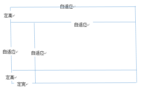
四、九宫格布局
使用table实现
.parent {
    display: table;
    table-layout: fixed;
    width: 100%;
  }

.row {
    display: table-row;
}

.item {
    display: table-cell;
    width: 33.3%;
    height: 200px;
}
使用flex实现
.parent {
    display: flex;
    flex-direction: column;
}

.row {
    height: 100px;
    display: flex;
}

.item {
    width: 100px;
    background: red;
}
五、全屏布局
使用绝对定位实现
<div class="parent">
      <div class="top">top</div>
      <div class="left">left</div>
      <div class="right">right</div>
      <div class="bottom">bottom</div>
</div>
html,body,parent {
    height: 100%;
      overflow: hidden;
}

.top {
    position: absolute: top: 0;
    left: 0;
    right: 0;
    height: 100px;
}

.left {
    position: absolute;
    top: 100px;
    left: 0;
    bottom: 50px;
    width: 200px;
}

.right {
    position: absolute;
    overflow: auto;
    left: 200px;
    right: 0;
    top: 100px;
    bottom: 50px;
}

.bottom {
    position: absolute;
    left: 0;
    right: 0;
    bottom: 0;
    height: 50px;
}
使用flex实现
<div class="parent">
      <div class="top">top</div>
      <div class="middle">
          <div class="left">left</div>
          <div class="right">right</div>
      </div>
      <div class="bottom">bottom</div>
</div>
.parent {
    display: flex;
    flex-direction: column;
}

.top {
    height: 100px;
}

.bottom {
    height: 50px;
}

.middle {
    flex: 1;
    display: flex;
}

.left {
    width: 200px;
}

.right {
    flex: 1;
    overflow: auto;
}
六、响应式布局
meta标签的使用
设置布局宽度等于设备宽度,布局viewport等于度量viewport。
<meta name="viewport" content="width=device-width,initial-scale=1">
媒体查询
- HTML4和CSS2目前支持为不同的媒体类型设定专有的样式表
- 例如同一个页面在屏幕上显示时使用无衬线字体,而在打印时则使用衬线字体,
screen和print是两种已定义的媒体类型 - 媒体查询让样式表有更强的针对性,扩展了媒体类型的功能
- 媒体查询由媒体类型和一个或多个检测媒体特性的条件表达式组成
- 媒体查询中可用于检测的媒体特性有
width、height和color等 - 使用媒体查询可以在不改变页面内容的情况下,为特定的一些输出设备定制显示效果
<link href="mobile.css" rel="stylesheet" media="screen and (max-device-width: 480px)">
@media screen and (max-width:960px) {
      //....
}